Sidenav Dispatch
With the opened input binding defined in the template the sidenav is either opened or closed when the value in the state object is updated.
Dispatch Action in Devtools
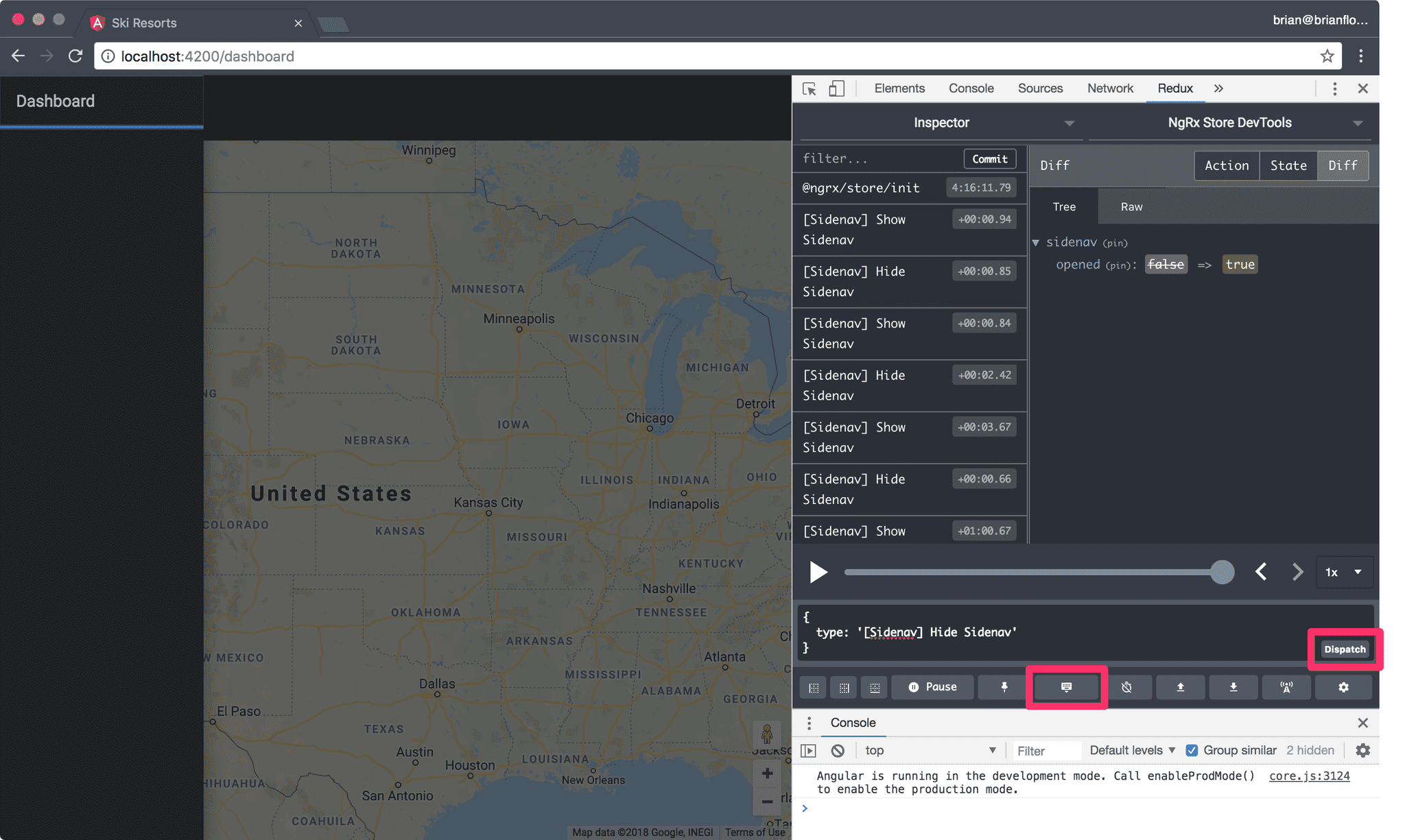
Let's test the binding using the Redux Devtools.
- Serve the application.
- Open the Redux Devtools.
- Open the dispatch tool.
- Specify an action object to be dispatch.
- Click the Dispatch button.
The action object for showing the sidenav is:
{
  type: '[Sidenav] Show Sidenav';
}
This is the type string that we defined as a member of the SidenavActionTypes enum in src/app/state/sidenav/sidenav.actions.ts.
When the Dispatch button is clicked you should see the sidenav open.
Dispatch Action in ShellComponent
First, open the src/app/core/shell/shell.component.ts file and declare a new openSidenav method:
import { ShowSidenav } from '@app/state/sidenav/sidenav.actions';

export class ShellComponent implements OnInit {
  // code omitted

  openSidenav() {
    this.store.dispatch(new ShowSidenav());
  }
}- Invoke the
dispatch()method on thestoreinstance. - Specify the
ShowSidenavaction to be dispatched. - Be sure to new-up the
ShowSidenavclass.
Invoke openSidenav() in Template
Open the src/app/core/shell/shell.component.html template and update the <button> in the <mat-toolbar> to invoke the openSidenav() method defined in the ShellComponent class:
<button class="menu-button" mat-icon-button (click)="openSidenav()">
  <mat-icon>menu</mat-icon>
</button>
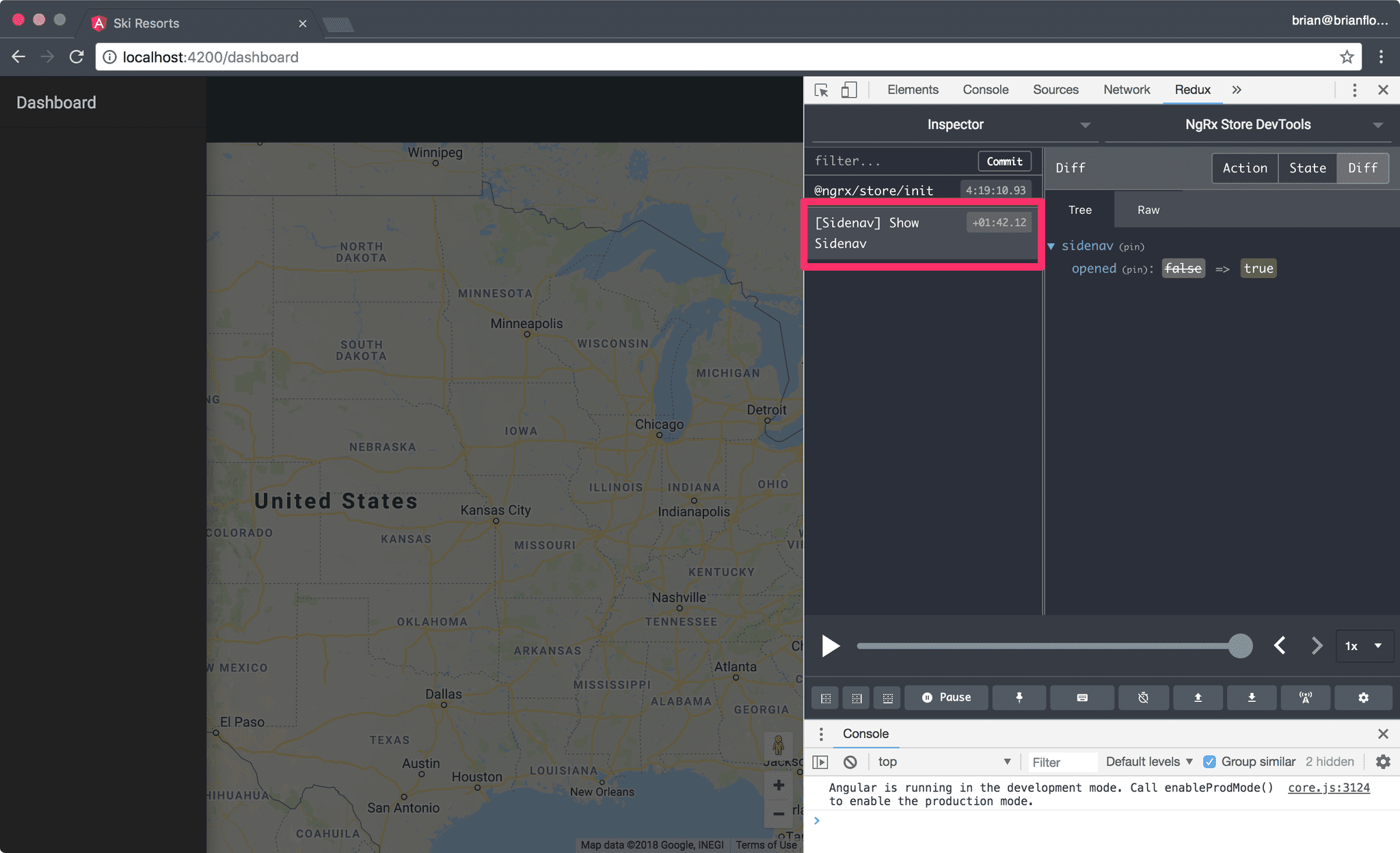
Open the application in your browser and click the hamburger (menu) button:
- When we click the button the sidenav is opened.
- The Redux Devtools is updated with the "[Sidenav] Show Sidenav" action.
- A diff of the new state of our application is shown.
- The
openedvalue is set totrue.
Toggle Sidenav
Our Angular Material sidenav behaves differently based on the side of the browser/device:
- On mobile the sidenav is displayed over the content.
- On larger than a mobile devices the sidebar pushes the content to the right to display the sidenav on the left.
To get started, open src/app/core/shell/shell.component.ts and declare two new methods:
closeSidenav()toggleSidenav()
import { HideSidenav, ShowSidenav } from '@app/state/sidenav/sidenav.actions';
import { first } from 'rxjs/operators';

export class ShellComponent implements OnInit {
  // code omitted

  closeSidenav() {
    this.store.dispatch(new HideSidenav());
  }

  openSidenav() {
    this.store.dispatch(new ShowSidenav());
  }

  toggleSidenav() {
    this.opened.pipe(first()).subscribe(open => {
      if (open) {
        return this.closeSidenav();
      }
      this.openSidenav();
    });
  }
}- The
closeSidenav()method dispatches theHideSidenavaction. - The
toggleSidenav()uses thefirst()operator to only listen to the first notification emitted by theopenedobservable when the method is invoked. - We
subscribe()to the notifacation and if theopenboolean istruethen we invoke thecloseSidenav()method otherwise we invoke theopenSidenav()method.
Invoke toggleSidenav() in Template
We need to toggle the visibility of the sidenav when either the hamburger (menu) button or the container's backdrop is tapped/clicked.
Open src/app/core/shell/shell.component.html and update the <button> and the <mat-sidenav-container> components to invoke the toggleSidenav() method:
<mat-sidenav-container
  (backdropClick)="toggleSidenav()"
  class="container"
  fxFlex
>
  <mat-sidenav
    #sidenav
    [mode]="isMobile ? 'over' : 'side'"
    [opened]="opened | async"
  >
    <!-- code omitted -->
  </mat-sidenav>

  <mat-sidenav-content>
    <mat-toolbar color="primary">
      <button class="menu-button" mat-icon-button (click)="toggleSidenav()">
        <mat-icon>menu</mat-icon>
      </button>
      <span>{{title}}</span>
    </mat-toolbar>
    <router-outlet></router-outlet>
  </mat-sidenav-content>
</mat-sidenav-container>- Note the
backdropClickoutput binding on the<mat-sidenav-container>component. - Note the
clickoutput binding on the<button>.
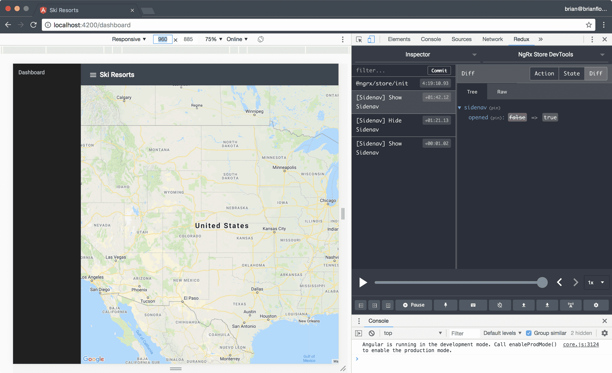
Open the application in your browser and enable the device toolbar. First, specify a width of 960 pixels or greater:
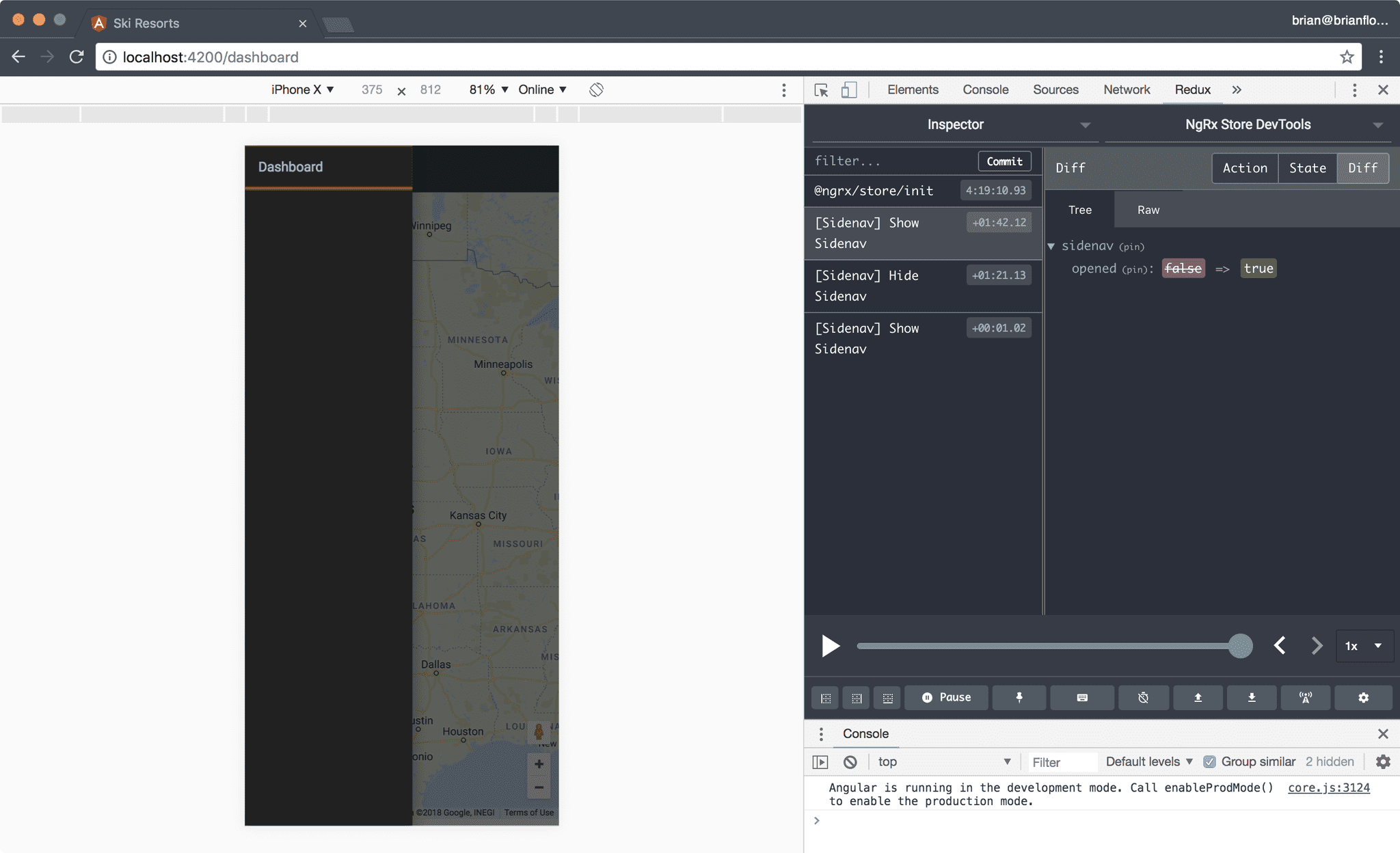
Then, specify a width less than 960 pixels:
- You can use the hamburger (menu) button in the toolbar to toggle the visibility of the sidenav on a non-mobile device as well as clicking/tapping the container's backdrop.
- You can open the sidenav using the hamburger (menu) button in the toolbar and close the sidenav by clicking/tapping the container's backdrop.
- Note the actions being dispatched in the Redux Devtools.
Pro Tip: Use the rewind and forward buttons or the scrub bar in the Redux Devtools to time travel in your application.


